APC Plumbing & Maintenance
Background:
After many years of service, APC Plumbing & Maintenance needed a rebrand to evolve and refresh its identity, aligning with a modern-day customer base.
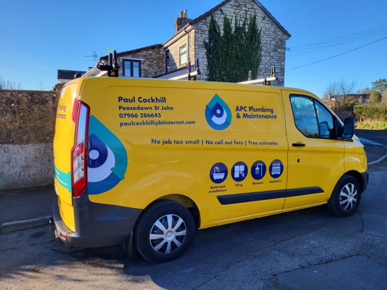
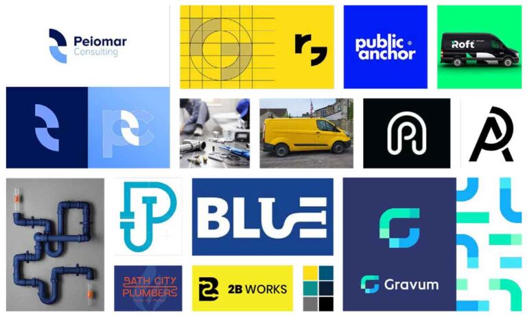
The client had recently purchased a new yellow van, which was chosen as the primary colour for the new palette and served as the inspiration for the mood board.
Developments:
Inspired by the solid and abstract shapes of pipes alongside the ‘APC’ initials, sketches and concept developments were initiated.
Using the golden ratio, a unique grid method was developed to find and create the abstract shapes of A, P, and C, which together create an illusion of a water droplet.

Branding:
The letters combine to form a clear water droplet shape. Adding the pipe ends to the ‘A’ and ‘C’ reinforces the plumbing theme, making them look like pipes. The centre of the ‘P’ can also be interpreted as a valve, wrench, spanner, or other plumbing tools.

The addition of a clear, bold typeface that stands strong against the logomark ensures it remains easily legible on any design application.
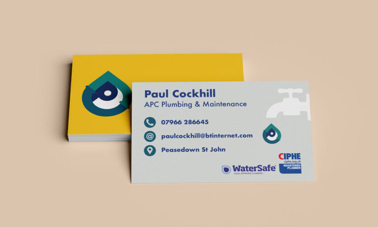
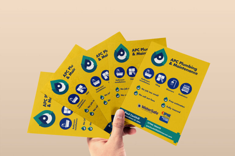
The rebrand was then applied across various materials, including van signage, business cards, leaflets, and more!
