ABC Blinds
Background:
ABC Blinds is a reputable window and blind company that has been serving Bridport and the surrounding areas in Dorset since 1977. Now in their third ownership era, they aim to maintain and broaden their reputation to appeal to a modern demographic through a rebranding of their identity.
Developments:
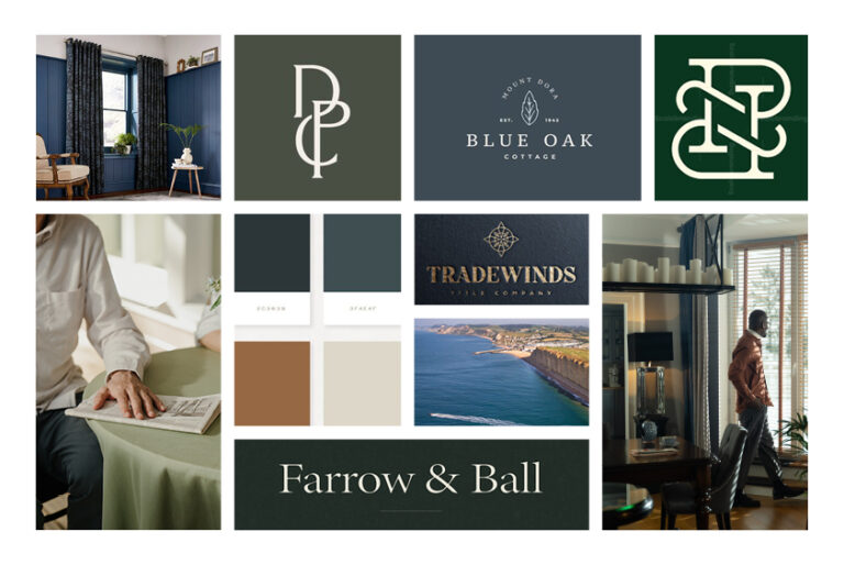
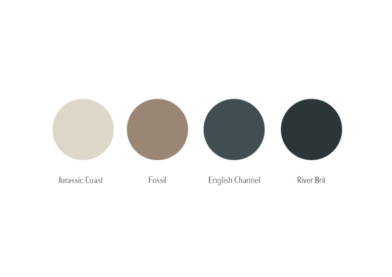
After thorough research into the business and the key elements of Bridport, the development route used colours like dark navy, teal, earthy browns, and creams to reflect the river and sea. The typeface was chosen to correspond with Bridport’s Saxon heritage, and subtle links to the business’s history were incorporated.
Branding:
The final branding of ABC Blinds strongly reflects the business’s heritage while incorporating modern, popular typefaces and layouts to make it contemporary.
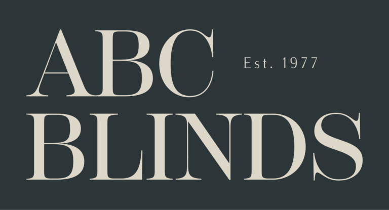
The logotype features a monogram of “ABC” in a serif, Saxon-inspired typeface, highlighting both Bridport’s history and the business’s heritage, including its three different owners.
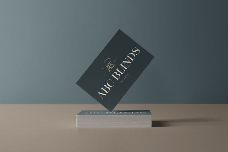
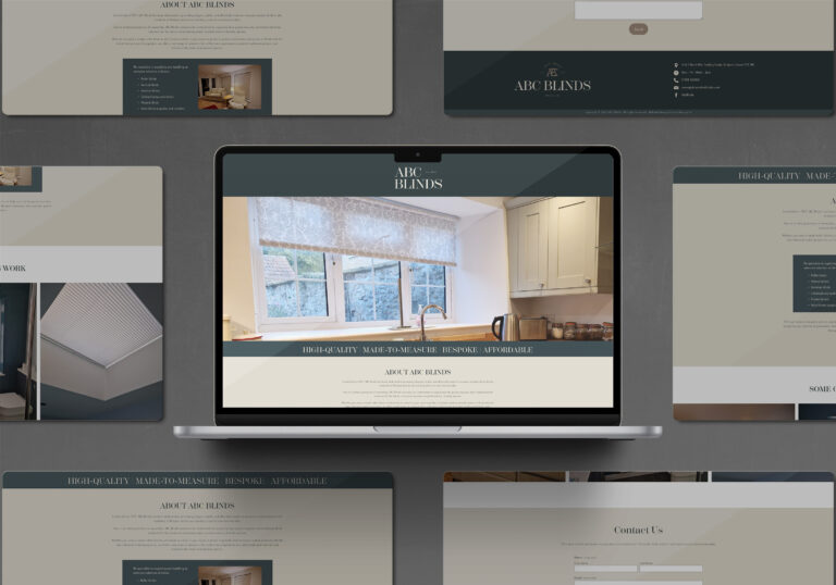
The client also needed a one-page website to enable clients to send inquiry forms. We applied all the new branding to create an established and comprehensive site – www.abcwindowblinds.co.uk
